How I rebuilt my personal site with a focus on simplicity, speed, and integrated blogging—the good, the bad, and the unexpected lessons.
The Itch to Rebuild
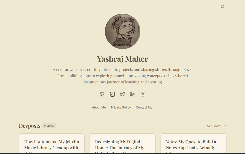
You know that feeling when you look at your own website and just... wince? That was me about three months ago. I'd built my personal site during my early coding days, and what had once felt like an achievement had turned into a source of embarrassment. Every visit felt like opening a time capsule of outdated practices and hacky solutions.
The breaking point came during a job interview when the interviewer pulled up my site and I found myself saying, "Oh, I've been meaning to rebuild that..." Truth is, I'd been "meaning to rebuild it" for over a year.
My list of grievances kept growing:
- Different pages looked like they belonged to different websites
- Dark mode? Non-existent (despite having added it to every client project)
- Adding a simple blog post required pushing code changes to production
- The mobile experience was, let's be honest, atrocious
So one Friday night, fueled by coffee and frustration, I opened a new VS Code window and started fresh. No copying over old code. No "let me just reuse this component." Complete reset.
The Redesign: Key Improvements
Visual Cohesion Through Design Tokens
My original site was a mess of hardcoded values:
// The old approach - a color nightmare
<header style={{backgroundColor: '#f4f4f4', borderBottom: '1px solid #e0e0e0'}}>
  <h1 style={{color: '#333', fontFamily: 'sans-serif'}}>My Projects</h1>
  <p style={{color: '#555'}}>Recent work</p>
</header>
Now everything uses design tokens through Tailwind's theming system:
// The new approach - semantic variables
<header className="bg-background border-b border-border">
  <h1 className="text-foreground font-display">My Projects</h1>
  <p className="text-muted-foreground">Recent work</p>
</header>
The result: I can change my entire color scheme by updating a few variables instead of hunting down every color code in the codebase.
Theme System: A Learning Experience
The theme toggle started as a simple implementation and grew into something more robust. Getting dark mode right was trickier than expected - especially preventing that dreaded "flash of wrong theme" on page load.
I started with the simplest approach:
// First attempt - too basic
function ThemeToggle() {
  const [isDark, setIsDark] = useState(false);

  return (
    <button onClick={() => setIsDark(!isDark)}>
      {isDark ? "Light" : "Dark"}
    </button>
  );
}
But quickly realized I needed to:
- Remember user preferences
- Respect system settings
- Handle theme changes across page navigations
- Prevent flashing on reload
After some research, I implemented a proper ThemeProvider with localStorage persistence and system preference detection. The coolest part? Discovering Tweakcn for generating a cohesive theme with all the right contrast ratios.
Rather than manually crafting CSS variables, Tweakcn let me visualize and adjust my entire color scheme in one go:
/* Sample of the generated theme variables */
:root {
  --background: #f8f5ee;
  --foreground: #3a382f;
  --primary: #7a6f50;
  --primary-foreground: #ffffff;
  /* dozens more variables... */
}
This approach meant I could preview how components looked in both themes simultaneously, ensuring consistency across the entire site.
Navigation: Small Details, Big Impact
The navigation overhaul wasn't just visual—it was about creating a consistent experience. I became obsessed with the "back" functionality, trying different approaches until I landed on a custom component:
// The backButton that started simple but became crucial
function BackButton({ href, label }) {
  return (
    <Link href={href} className="group flex items-center">
      <ArrowLeft className="group-hover:-translate-x-1 transition-transform" />
      <span>{label || "Back"}</span>
    </Link>
  );
}
This seemingly simple component appears throughout the site, creating a consistent way to navigate backward. The subtle animation on hover (-translate-x-1) gives just enough feedback without being distracting.
Content Management: Git as a CMS
The biggest functional improvement was switching from hardcoded content to Markdown files. Instead of embedding blog posts in components, I created a simple file-based system:
public/
  Bposts/           # Blog articles
    my-first-post.md
    website-redesign.md
  devposts/         # Developer-focused posts
    building-with-nextjs.md
Each file uses frontmatter for metadata:
---
title: "My Post Title"
date: "2024-05-15"
description: "A brief summary that appears in previews"
author: "Yashraj Maher"
authorImage: "/my.png"
---

The actual content goes here...
This approach means I can:
- Write content in Markdown (much more pleasant than JSX)
- Add new posts by simply creating files (no code changes)
- Include rich metadata for each post
- Use Git history to track content changes
The implementation is straightforward—read files at build time, parse the frontmatter, and render with React Markdown. But the impact on my writing workflow has been enormous.
The Technical Stack: Decisions & Implementation
In my early days as a developer, I often relied on Vite for my projects. However, with more experience under my belt, I've come to appreciate Next.js as a solid alternative that offers its own set of advantages.
I rebuilt everything on Next.js and Shadcn Components—a combination that's become my go-to for balancing developer experience with performance.
The Build System
The transition to Next.js App Router was a game-changer for how I structure code. Instead of the old Pages Router where everything lived in a flat structure, I could now organize related features together:
// Structure of my app directory
app/
├── (blogs)/           # Blog-related routes
│   └── blog/
│       ├── [id]/      # Dynamic route for individual blog posts
│       └── page.js    # Blog listing page
├── (projects)/        # Project-related routes
├── about/             # About page
├── components/        # Shared components
└── utils/             # Utility functions
The whole mental model shifted—I could co-locate related components, create better abstractions, and generate metadata for SEO directly in each page component. No more jumping between files trying to piece together how a feature works.
The Real Challenges
Let's be honest—rebuilding a site is never as smooth as those polished tutorials suggest. Here's what actually tripped me up:
Markdown Rendering: A Rabbit Hole
What seemed like a simple task—"just render some markdown"—turned into days of experimenting with different libraries. I tried markdown-it, Remarkable, and finally settled on react-markdown with a stack of plugins:
// The simplified version of what worked
<ReactMarkdown
  remarkPlugins={[remarkGfm, remarkBreaks]}
  rehypePlugins={[rehypeRaw]}
  components={{
    code: MyCustomCodeComponent,
    // Other component overrides...
  }}
>
  {content}
</ReactMarkdown>
The real struggle wasn't the code itself but figuring out which combination of libraries would handle all my use cases—syntax highlighting in code blocks, proper table rendering, and preserving inline HTML when needed.
Theme System: The Color Conundrum
Getting a cohesive color system that worked in both light and dark mode was frustrating until I discovered Tweakcn. This visual editor for shadcn/ui components let me generate a complete theme system:
:root {
  /* Light theme variables generated by Tweakcn */
  --background: #f8f5ee;
  --foreground: #3a382f;
  /* ...more variables... */
}

.dark {
  /* Dark theme variables */
  --background: #2c2a25;
  --foreground: #e0d8c5;
  /* ...more variables... */
}
Instead of manually tweaking colors and trying to maintain contrast ratios, I could visualize the entire system at once. The CSS variables approach with Tailwind meant I could use utilities like bg-background and text-foreground that automatically responded to theme changes.
Animation Balance
I went a bit overboard with animations initially—hover effects everywhere, page transitions, fancy gradients. When I tested on my old phone, the performance hit was obvious:
/* Just one of many animations I had to tone down */
@keyframes flowingBorder {
  0% { background-position: 0% 50% }
  50% { background-position: 100% 50% }
  100% { background-position: 0% 50% }
}
I ended up stripping back most animations and keeping only those that enhanced the experience without being distracting. The site feels much snappier now, especially on mobile.
Lessons Learned: The Meta-Knowledge
The biggest lessons weren't technical but methodological:
-
Start with content structure, not design: I initially wasted time designing components before I had a clear content model. Once I focused on what information needed to be displayed, the design decisions became much clearer.
-
Optimize for maintenance: Every feature I added, I asked myself "will this be painful to update in 6 months?" This pushed me toward simpler solutions and better documentation.
-
Test on real devices early: I found layout issues on mobile that weren't apparent in Chrome's device simulation. Testing on actual phones saved me from post-launch embarrassment.
-
Choose existing solutions for solved problems: I initially tried to build custom components for things like dropdowns and tooltips before realizing Radix UI had already solved these problems better than I could.
What's Next: The Roadmap
The site's foundation is solid, but I have plans:
- Analytics dashboard: Visualizing which content resonates
- Comment system: Adding discussions without third-party services
- More interactive components: Code Blocks With Wrap, Collapse and Copy Functions
- Subtle Animations: Using Animate UI Library To Add Smooth Scroll Animations, and page transitions.
The Takeaway
Redesigning my site was more than an aesthetic exercise—it was about creating a foundation that could grow with me. The clean, cohesive design reflects how I've evolved as a developer, while the integrated blogging system removes friction from sharing ideas.
Projects like personal websites are never truly "finished"—they grow and shift as we do. Each commit represents a moment in my journey, and I'm excited to see where it goes next.
If you're considering your own redesign, my advice is simple: focus on what frustrates you most about your current site, and solve that problem first. Everything else will follow.
Check out the Source Code at Github Yashraj Maher and let me know what you think!
Resources
Here are the key tools and resources that made this redesign possible:
-
Tweakcn: Visual editor for shadcn/ui themes that saved me countless hours of color tweaking. This tool was essential for creating a cohesive light/dark theme system.
-
Next.js: The React framework I used for all routing, server components, and metadata generation. The App Router structure transformed how I organize code.
-
Tailwind CSS: My styling framework of choice. The utility-first approach with theme variables made creating a consistent design system much easier.
-
Shadcn UI: Not a component library, but a collection of reusable components built with Radix UI and styled with Tailwind. These served as the foundation for my UI.
-
React Markdown: The library I settled on for rendering Markdown content after trying several alternatives.
-
Radix UI: Headless UI components that provided accessibility and functionality while letting me control the styling completely.
-
date-fns: Simple date utility library used for formatting dates in blog posts and project cards.
-
Vercel: Where the site is deployed, providing analytics and edge functions.